Introduction to Photoshop
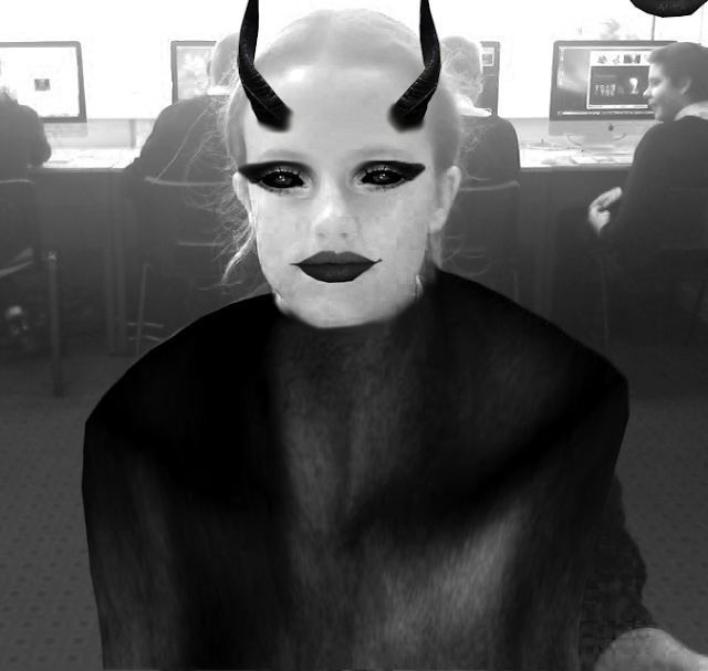
We used Photoshop to create a zombie face using layers, the lasso tool and image adjustments. The image above was my first attempt.
Self Assessment.
WWW - I think I did quite well at the eyes as they look quite tired and a little bit zombie-like.
NTT - My next time target would be to make it look more realistic because it looks like I've just cut out and added bits onto my face.
--------------------------------------------------------------------------------------------------------------------------
 WWW- I think I was better at editing different parts of the monster onto my face
NTT- It doesn't look very realistic so I need to work on that. Also the mouth makes it look a bit funny.
--------------------------------------------------------------------------------------------------------------------------
 WWW- I think I was better at editing different parts of the monster onto my face
NTT- It doesn't look very realistic so I need to work on that. Also the mouth makes it look a bit funny.
Interesting outcomes! I agree with your assessments.
ReplyDeleteWWW - you have used the transform tool well to make the sections fit to the shape of your face.
NTT - make sure you explore the Hue/Saturation more to match up the colours of the different layers. Avoid just changing it to black and white - it doesn't always help!