Coursework


Cover Analysis - Billboard

Double Page Spread Analysis - Top of the Pops

Monday 14th May 2018Coursework Planning
L.O. plan an effective product aimed at a specific audience using appropriate codes and conventions.
Codes and Conventions.
Layout
- House style - in the magazine cover, the layout is the same as the other magazines Billboard have done because the masthead is at the top, the cover lines are on one side and the main image is in the middle. In the double page spread, the house style is the main image on one side, over lapping the middle with boxes of writing to the other side of it, the title of the article is at the top and and there is the 'Exclusive Interview' tag at the top.
- Symmetrical and asymmetrical - both the cover and double page spread are asymmetrical because the writing is always on one side of the image and not on the other side.
- Use of columns and boxes - the Billboard cover uses columns to make their cover lines in one straight line and boxes to separate each cover line. The double page spread uses columns and boxes to line up each paragraph of writing.
- Ratio of words, photography and space - in the cover, the ratio is off because their are only cover lines on the left side, and the main image of Katy Perry is slightly to the left. In the double page spread, the writing is all to the left of the photography that is slightly over lapping the middle.
- Masthead - both of there mastheads are at the top of the cover and article, so I will include this as it follows codes and conventions.
- Caption - the main cover line explains the main image and some of the contents of the magazine. In the double page spread, there is a green piece of writing above the main body of information which helps describe what the writing is about.
- Strapline - both of them do not have a strapline but i will include one because it follows codes and conventions.
- Standfirst - there is a stand first in the double page spread, introducing the article and what it is about.
Typography
- Serif and sans serif - there are some aspects of serif fonts, but they are mainly sans serif fonts as this gives off a more modern feel.
- Font size/italics/bold - the masthead and main cover lines follow codes and conventions as they are bigger and bolder than the rest of the writing.
Language
- Formal register - as these are both aimed at young people, they have quite an informal register, which is something i will have to think about.
- Direct mode of addressed - this is used to help draw the audience in to read it.
- Puns, colloquialism, slang - the cover does not use these but the double page spread might as it is quite casual.
Image
- Graphics - except from the main image, there are not many graphics in the cover and double page spread, except for the puffs.
- Camerawork - the cover and double page spread uses a medium shot.
- Depth of field - they both have a shallow depth of field because they are focussed on the object closest to the camera.
- Digital manipulation - photoshop has more than likely been used to make the celebrities look 'better' and the colours brighter.
- Cropping - it doesn't look as if there has been any intentional cropping to remove something in both pictures.
Colour
- House style - the Billboard masthead is coloured in red, blue and yellow which is the old house style of billboard. The double page spread uses colours that its target audience would like, which follows Top of the Pops' codes and conventions.
- Colour saturation - it does not look as if any colour saturation has been used because in both.
- Choice of colour - the colour choices both link to the young target audience and they both use bright colours.
Initial Planning
- Title ideas - Number1, Number One, Pop Weekly, Charts, A List, Platinum
- Tagline - Pop, Drop and Roll, The Number1 source for everything pop, no one does pop like ''.
- Genre - Pop music, teenagers
- Representation - girly, feminine, youthful, trendy
- House style - colour palette, sans serif fonts, modern, bright colours
- Colour palette (cover) - french rose, orange and pink
- Cover image - someone that represents a celebrity
- Possible cover lines - current songs, incentives, information about main image
- Information to include - 'celebrity' information, current pop music
- DPS article topic - interview, fact file
- DPS images - 'celebrity'
- DPS title - name of celebrity, quotes from celebrity, 'world exclusive'.
- Masthead Fonts - LOTTE PAPERFANG, Disco Diva, Hollywood Hills, Coolvetica, Condition,
- Interview questions -
- Introduction
- How has your life changed since your number 1 hit?
- Who has been your biggest inspiration?
- What can you tell us about yourself that nobody else knows?
- If you could collaborate with anyone, who would it be and why?
- What can we expect from you in the future?
Interview:

 Hi there Danae, thank you so much for
being here, how are you?
Hi there Danae, thank you so much for
being here, how are you?
Hi! Thank you so much for having
me, I’m not going to lie, ‘platinum’ is actually my favourite magazine so I’m
so excited to be here!
Great! We have a few questions to ask
you today, and the first one is: how has your life changed since your number 1
hit, “I’m Not Waiting”?
Honestly, this has been the
craziest few months of my life. I am enjoying every second, I love learning new
things and making more friends within the industry. Every day is a learning
curve and I am the luckiest person to be able to make music, which is what I
have always and will always love.
Amazing! Who has been your biggest
inspiration and why?
For me, it’s out of two people. One
of them is Sia, I have always loved her songs, her individuality and her voice
is so incredible. My other inspiration is my mum. I know it’s a bit cliché but
she inspires me daily to try my best and without her support, I wouldn’t be
where I am today.
And is there anything you can tell us
about yourself that nobody else knows?
I can, when I was
a baby, my first word was actually the word ‘sing’!
Wow, no way! Now who would you like
to collaborate with most?
Ok, earlier I
mentioned I love Sia so I will definitely say her, but I also love Ariana
Grande so it would be great to collaborate with her too.
Awesome! And our final question today,
what can we expect from you in the future?
Well, world
exclusive, I will be going on tour next year! The tickets will be available at
the end of July and I will be performing songs from my new album, out on July 1st!
So exciting! Thank you, Danae, for
doing this interview with platinum, all the best for the future!
Standfirst
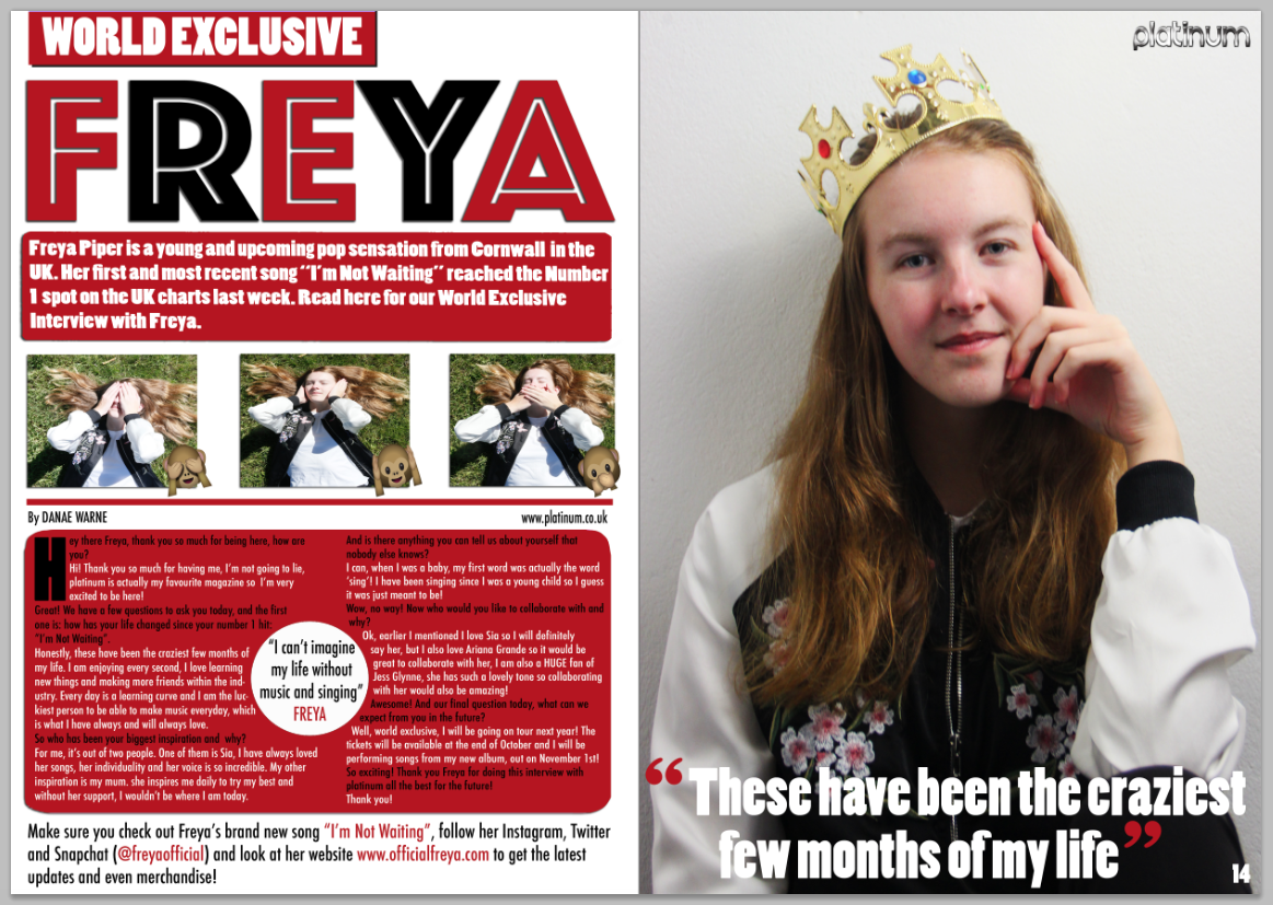
Freya Piper is a young and upcoming pop sensation from Cornwall in the UK. Her first and most recent song “I’m not Waiting” reached the number 1 spot on the UK charts last week. Read below for our world exclusive interview with Freya.
Standfirst
Freya Piper is a young and upcoming pop sensation from Cornwall in the UK. Her first and most recent song “I’m not Waiting” reached the number 1 spot on the UK charts last week. Read below for our world exclusive interview with Freya.


My Plan
- 10th September - last bits on front cover
- 13th September - finish front cover and start DPS
- 17th September - continue on DPS
- 24th September - continue and finish DPS
- 27th September - final touches on cover and DPS
- 28th September - hand in coursework
28th September 2018 - Coursework Hand-In


30th September Feedback:
ReplyDeleteWWW: Great layout - well done
EBI:
1. Cover image is over exposed (too light)
2. Cover lines on left need to be further from image
3. Details needed - website on DPS page line, cover line colour choice, images still not top level